# reading in packages
library(tidyverse)
library(janitor)
library(readr)
library(dplyr)

# reading in data
green <- read.csv("data/GB.csv")
utility <- read.csv("data/Utilitydata.csv")Ellison Hall Green Building Assessment
A case study analyzing sustainability performance and retrofit opportunities at UCSB’s Ellison Hall.
Overview
This case study evaluated the energy and water performance of Ellison Hall, a high-occupancy academic building at UCSB originally built in 1969. Despite earning LEED Gold certification, Ellison Hall revealed ongoing inefficiencies, particularly in water use, that could be addressed through cost-effective retrofits. The assessment focused on ENERGY STAR benchmarking, indoor water use analysis, and recommendations for both low-cost and capital-intensive improvements to align the building with UCSB’s climate action goals.
Use of R Studio
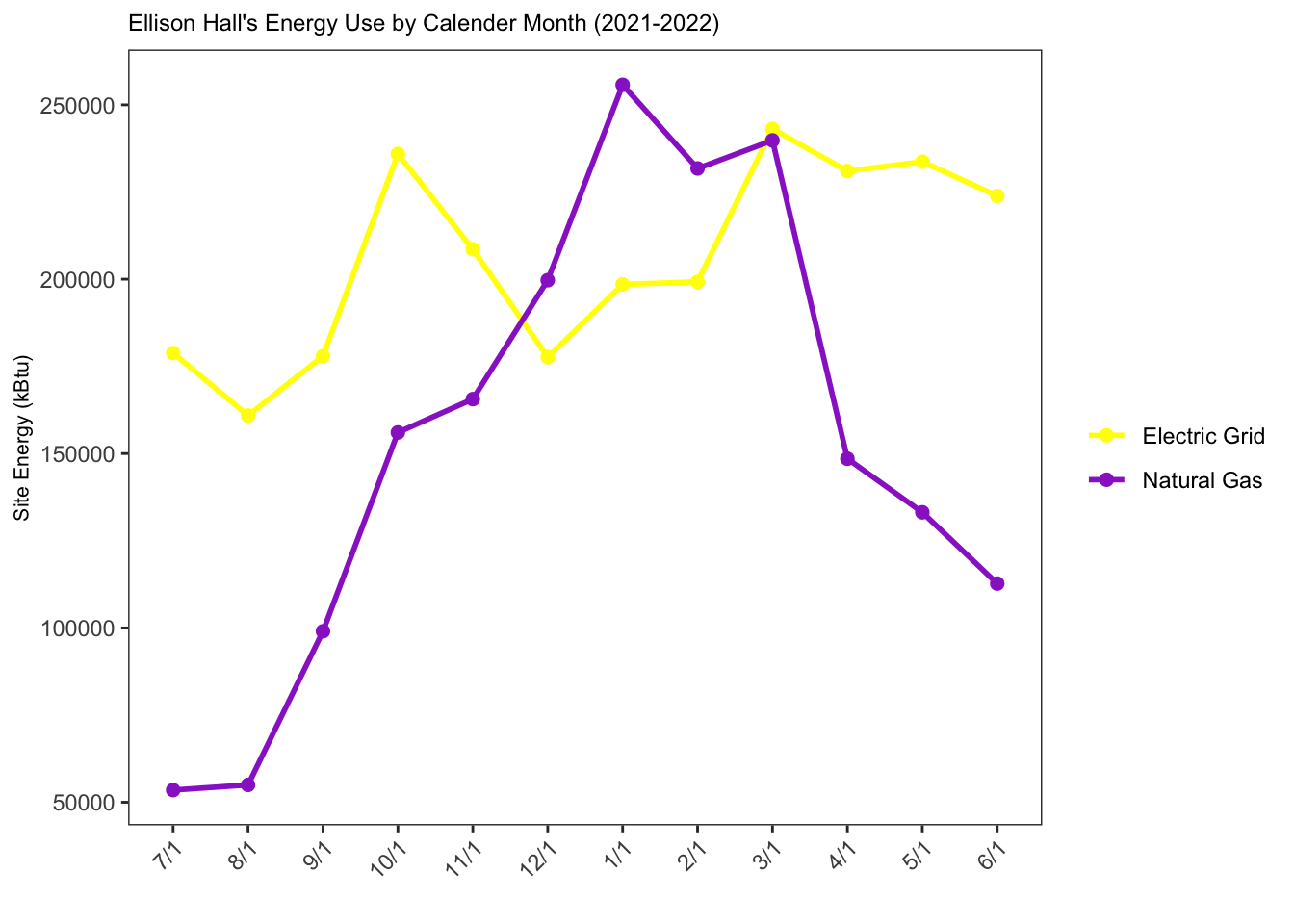
This project also allowed me to apply skills gained in my Environmental Data Science coursework. Although data analysis was not explicitly required for this case study, I took the initiative to organize, clean, and visualize the utility data collected for Ellison Hall. For instance, water and electricity usage data for the building did not follow the standard calendar year, requiring careful data wrangling to ensure it could be plotted effectively. This process included converting electricity and natural gas usage to a common unit (kBtu) and restructuring the data for accurate visualization.
Adding customized figures and visualizations to this project not only showcased my technical skills but also deepened my understanding of how to present data with intention. As shown in the figures below, I wrote code to compare Ellison Hall’s water and energy use intensity (EUI) to baseline metrics and national averages. This work highlights my ability to critically assess data, apply coding skills to real-world scenarios, and present findings in a clear and impactful way.
Code
# creating a new data frame and selecting the necessary rows
green_clean <- green |>
  filter(Location %in% c("Ellison", "National"))


# EUI Data Visual
ggplot(data = green_clean, # data frame being used
       aes(x = Location, # assigning the x-axis
           y = EUI, # assigning the y-axis
           fill = Location)) + # ensuring the locations will be different colors

  # type of visual that is being used
  geom_col() +

  # adding labels to the top of the bars
  geom_text(aes(label = round(EUI, 1)),
            vjust = -0.5,
            size = 2.5) +

  # changing and cleaning the title as well as the x & y axis
  labs(title = "Ellison Hall Energy Use Intensity Compared to the National Average",
       x = "Site Location",
       y = "Energy Use Intensity (kBtu/ft²)") +

  # manually changing the colors of the bar chart
  scale_fill_manual(values = c("Ellison" = "blue4",
                     "National" = "red4")) +

  # changing the theme to a preset template
  theme_bw() +

  # manually changing the theme to include different elements from the preset template "bw"
  theme(plot.title = element_text(size = 10),
        panel.grid.major = element_line(color = NA),
        panel.grid.minor = element_line(color = NA),
        legend.position = "none")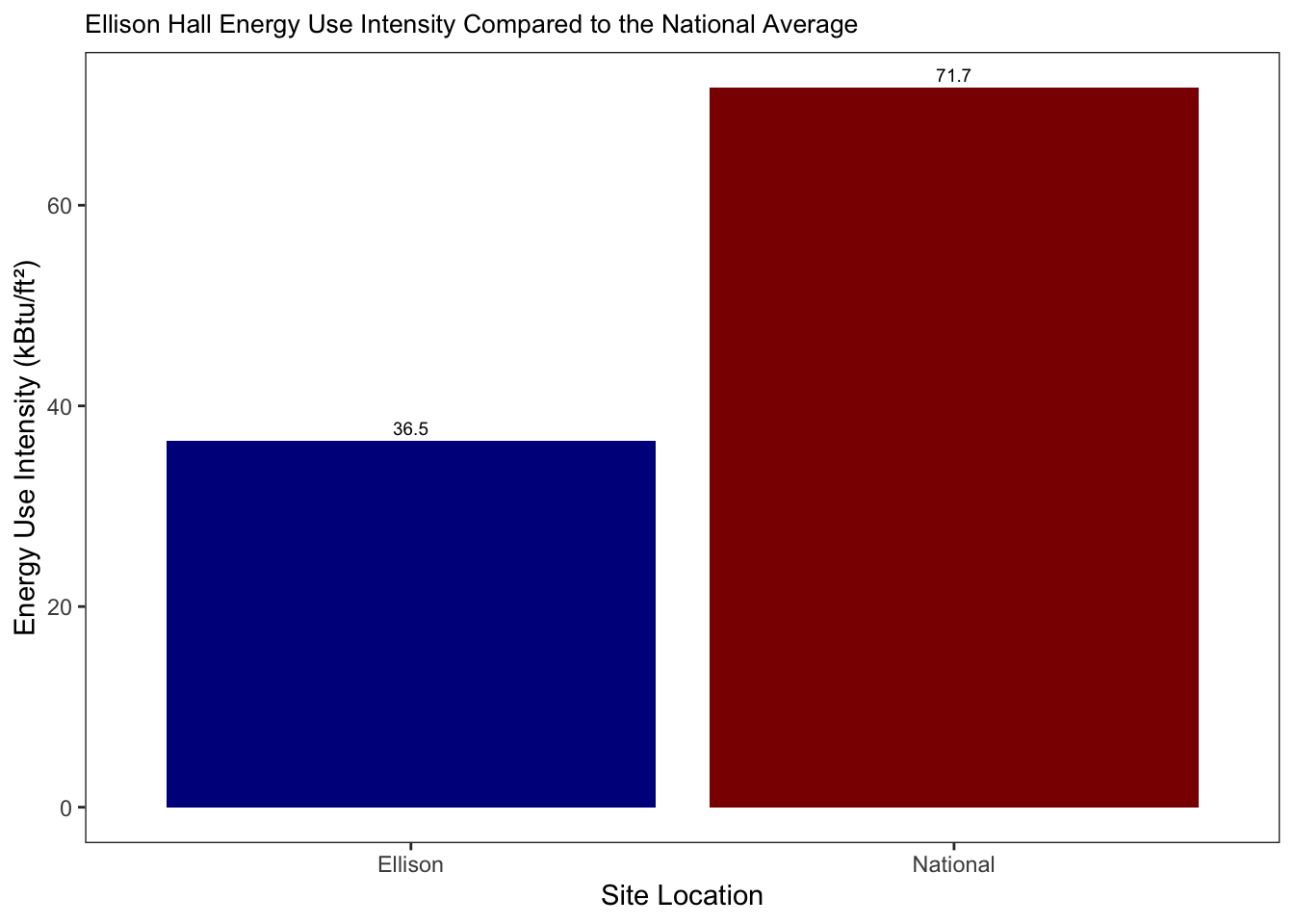
# change the order of the bar chart to keep it consistent
green$Location <- factor(green$Location, levels = c("Ellison", "Baseline"))
# to make sure the csv file is read is as a number and no separate values are separated by commas
green$Water <- as.numeric(gsub(",", "", green$Water))
# creating new data frame with only necessary rows
green_water <- green |>
filter(Location %in% c("Ellison", "Baseline"))
# Water Visual
ggplot(data = green_water,
aes(x = Location,
y = Water,
fill = Location)) +
geom_col() +
# type of visual that is being used
geom_text(aes(label = round(Water, 1)),
vjust = -0.5,
size = 2.5) +
# changing and cleaning the title as well as the x & y axis
labs(title = "Ellison Hall Annual Water Consumption Compared to the Baseline ",
x = "Location",
y = "Water Consumption (gallons)") +
# manually changing the colors of the bar chart
scale_fill_manual(values = c("Ellison" = "blue4",
"Baseline" = "red4")) +
# changing the theme to a preset template
theme_bw() +
# manually changing the theme to include different elements from the preset template "bw"
theme(plot.title = element_text(size = 10),
panel.grid.major = element_line(color = NA),
panel.grid.minor = element_line(color = NA),
legend.position = "none")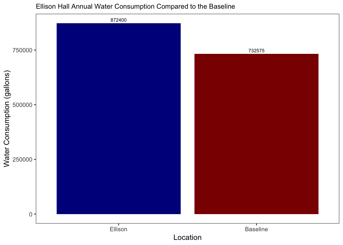
# converting values into a common unit (kBtu) while cleaning the column names
utility_clean <- utility |>
  clean_names() |>
  mutate(
    electric_meter_usage = as.numeric(gsub("[^0-9.]", "", electric_meter_usage)) * 3.412,
    gas_meter_usage = as.numeric(gsub("[^0-9.]", "", gas_meter_usage)) * 1.037) |>

  # ensuring that the months will be plotted in the same order as the water and electricity year
  mutate(date = as_factor(date),
         date = fct_relevel(date,
                            "7/1", "8/1", "9/1", "10/1", "11/1", "12/1", "1/1", "2/1", "3/1", "4/1", "5/1", "6/1")) |>


  # selecting the necessaey columns for visual
  select(date, electric_meter_usage, gas_meter_usage) |>

  # putting the dataset in long format so we can group and compare the electric and gas meter usage
  pivot_longer(cols = c(electric_meter_usage, gas_meter_usage),
               names_to = "meter_type",
               values_to = "usage_kbtu")
# Electric vs. Natural Gas usage Visual
ggplot(data = utility_clean, # dataset being used
aes(x = date, # assigning the x-axis
y = usage_kbtu, # assigning the y-axis
color = meter_type, # ensuring the colors will different based on the meter type
group = meter_type)) + # grouping the electric and gas meters together
# visual being used
geom_line(linewidth = 1) +
# visual being used
geom_point(size = 2) +
# manually changing the colors
scale_color_manual(values = c("electric_meter_usage" = "yellow1", "gas_meter_usage" = "darkorchid3"),
labels = c("Electric Grid", "Natural Gas")) +
# changing and cleaning the title as well as the x & y axis
labs(title = "Ellison Hall's Energy Use by Calender Month (2021-2022)",
x = "",
y = "Site Energy (kBtu)", # cleaning the title names
color = "") +
# changing the theme to a preset template
theme_bw() +
# manually changing the theme to include different elements from the preset template "bw"
theme(
panel.background = element_rect(fill = "white"), # changing the background color
plot.title = element_text(size = 9),
panel.grid.major = element_line(color = NA), # removing the color to the grid lines
panel.grid.minor = element_line(color = NA), # removing the color to the grid lines
axis.text.x = element_text(angle = 45, hjust = 1),
axis.title.x = element_text(size = 8), # this is correct
axis.title.y = element_text(size = 8) # adjust if needed
)